Our Thoughts On The New Visit Madeira Brand

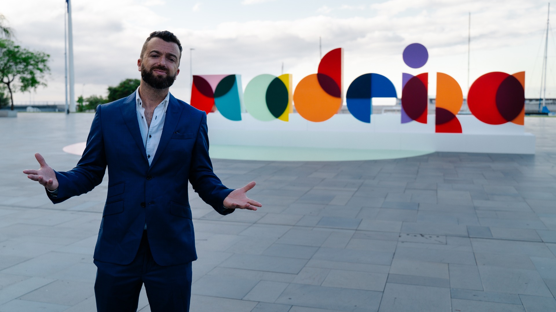
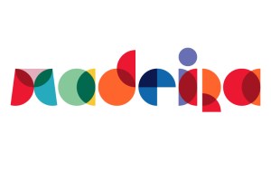
Madeira has a new brand, it’s modern, forward thinking, colourful and well thought out. The only thing is, the majority of the locals and even tourists, don’t like it. The first time I saw it, I must admit, I was a bit confused. I had to take a second or two to think about it as well as a second go at reading it but, just as I thought I wasn’t impressed, I saw it on instagram, in small writing with a white background and I was sold, I loved it.

Technically, all the folclore colours are there, including the white stripe if you look closely between the R. The 11 colours represent each of the 11 municipalities of Madeira, including Porto Santo. The letters are made of circles or semicircles which represent a sort of inclusion of all, best represented as Belonging, hence the new slogan, Madeira Belongs to All.
